COMPS--LOGO--IDENTITY SYSTEM OPTIONS
1. Comp Peer Review:
You may need to reduce or skip this step to keep on track to meet the deadline. This is worth much less points than the finished logo and identity system--it may be worth taking a point reduction to stay on schedule.
A. Perhaps just show one comp to peers.
B. Or just do a self-review.
C. Or have only one other peer review your comp(s).
D. Or submit a summary of how your idea evolved without the peer review per se.
2. Logo:
It had been originally stated it would be required to do the logo in full color and black and white. Do the full color one first. Apply that to your identity system. Go back and rework the logo to black and white for extra credit.
3. Business Card:
It is only required that you design a single business card. I normally have students complete an 8-up layout for more InDesign experience. The 8-up layout can be done for extra credit--I will demo this on Monday, can give you the directions today if you want to try on your own. Find the directions HERE
WRITE-UP
The write-up for this assignment can be found at: STEP STU SHARE > Art Technology > Logo_Identity System > Logo_ID_WriteUp.doc
Tuesday, December 15, 2009
PEER REVIEW of COMPS
When you complete your two COMPS, you will then start the refining process.
Print your comps, then revisit the logoblog and allgrahicdesign websites.
A. Respond to the following questions:
1. Name one way your comps show the traits of an effective logo OR one way the comps strongly meet the assignment criteria on the logo rubric.
2. Name one way your comps can be revised to better follow the principles of an effective logo OR one way the comps do not meet the assignment criteria on the logo rubric. Also provide a suggestion for how to change the comps to fix the issue.
B. Then get 3 peers to review your comps and answer the same questions listed above.
C. What advice from your peers will you follow? Why?
D. What advice from your peers do you disagree with most? Why?
E. Which comp will you continue to refine into your final logo? Why?
Monday, December 14, 2009
FROM CONCEPT BOARD TO COMPS
Now that you have developed a CONCEPT BOARD to form a solid idea base for your logo, it is time to combine the ideas from that into some possible logos--these possible logos are called COMPS. You will develop a minimum of two COMPS in a single Illustrator document. The comps are due by the end of the period on Wednesday, December 16. You will use feedback from peer editing to refine your comps and develop the final logo.
Each comp must meet the following criteria:
1. Must represent a minimum of three items featured in your concept board: (Title, supporting adjectives, images, fonts or colors.)
2. Must clearly exhibit at least three of the following DESIGN ELEMENTS: Directional line, Geometric shapes, Asymmetrical/symmetrical/radial balance, contrast, emphasis, scale.
3. Must be created in Adobe Illustrator.
4. Must feature at least two of the following Illustrator tools/techniques: Type on a Path, Live Trace/Live Paint, Transform tool (rotate, reflect or shear), Offset Paths or Compound Paths, Pathfinder tool, Clipping Mask, Calligraphic Brush, Art Brush).
Thursday, December 10, 2009
FRIDAY, DECEMBER 11
1. Finish and turn in LOGO ANALYSIS assignment. Here are the LINKS you need to do it.
2. Begin working on CONCEPT BOARD.
3. If you finish the concept board, create a flyer for the STEP WINTER FESTIVAL.
4. If you are missing work, and have extra time, go back and finish/turn in missing assignments. Everyone has received a progress report, you should know what you need to do.
CONCEPT BOARD
Design Challenge:
Create a logo, business card, letterhead and envelope (aka identity system) for one of the following:
• Yourself
• Your own client
• STEP Radio
• Ms. Lipa (STEP Career Center)
Step 1/The Concept Board:
• Begin by creating a concept board to guide your creative vision. A concept board is a collection of elements that provides the overall impression of the look/feel of your final logo and identity system. Check out the samples on the bulletin board.
It should contain the following elements:
1. The title of your concept: It may be one word or a phrase placed at the top of your board.
2. A minimum of five (5) adjectives that describe you or the client organization,
3. A minimum of ten (10) images that visually represent the adjectives you selected.
4. A minimum of three (3) fonts that complement/support your concept.
* 3 fonts = 1 serif, 1 sans serif and 1 decorative or script font.
* Include the fonts by typing your adjectives with them.
5. A minimum of three (3) colors other than white that reflect your concept.
• Concept board can be assembled using the following methods:
1. Print out images from the Internet and cut images out of the stock catalogs, and collage them together with your title, colors and words on the board provided.
2. Organize your images, title, colors and words in a legal size (8.5 x 14) Photoshop, Illustrator or InDesign document.
Wednesday, December 9, 2009
LOGO ANALYSIS ASSIGNMENT:
Directions: Compile all responses for this assignment in a Microsoft or Adobe document. All necessary links are in the post below this one. Print and turn in to basket by end of day.
1. List the 5 elements of an effective logo listed at logoblog.com and the 8 elements of an effective logo listed at allgraphicdesign.com (Hint: just copy and paste from the Web into your document.)
2. Check out the SAMPLE LOGOS at www.logopond.com and www.yourlogomakesmebarf.com Select a sample logo from each site. List two ways each logo does/does not meet the criteria of an effective logo.
3. Read the advice on designing logos from designers Mark Misenheimer, Angela Ferraro-Fanning and Jose Soto. (a)Name one thing their tips have in common. (b)Name one way they differ. (c)Which designer's process seems most like how you would work? Why?
Tuesday, December 8, 2009
LOGO LINKS
COMPONENTS OF AN EFFECTIVE LOGO:
http://www.logoblog.org/famous_logo_design.php
http://www.allgraphicdesign.com/graphicdesignarticles/logographicdesign/logos-designeffectivelogo.html
SAMPLE LOGOS:
http://logopond.com/gallery/?month=&year=&page=1
http://www.yourlogomakesmebarf.com/
ADVICE FROM PROFESSIONAL DESIGNERS:
http://www.allgraphicdesign.com/graphicsblog/2008/04/logo-design-creation-process-from-start-to-finish-by-expert-graphic-designer-angela-ferraro-fanning/
http://www.allgraphicdesign.com/graphicsblog/2008/08/logo-design-creation-process-from-start-to-finish-by-expert-graphic-designer-jose-soto/
http://www.allgraphicdesign.com/graphicsblog/2008/07/logo-design-creation-process-from-start-to-finish-by-expert-graphic-designer-mark-misenheimer/
http://www.allgraphicdesign.com/graphicsblog/2008/02/how-to-design-a-logo-for-your-customer-a-logo-design-tutorial-for-freelance-designers/
Monday, December 7, 2009
Friday, December 4, 2009
Thursday, December 3, 2009
Continuing on with yearbook stuff
1. Finish organizing the keeper photos for each course your group is covering.
2. Record the Shared photo folder and number on the photo log (ie stepstushare > Yearbook Photos > AM Session > Art Technology > DSC90210.JPG)
2. Save copies of the keeper photos in your server folder or flash drive. Your group can name and divide the copies however you see fit.
3. Begin writing captions, using the information from the photo logs as a base. Look through the previous yearbooks to see example captions. They should be informative and concise. Here are some links to caption writing tips:
http://web.ku.edu/~edit/captions.html
http://www.poynter.or/content/content_view.asp?id=4865
http://www.notrain-nogain.org/Train/Res/Write/caps.asp
Tuesday, December 1, 2009
Monday, November 23, 2009
Critique Assignment
1. Open CRITIQUE_ASSIGNMENT.doc in the Shared Art Technology folder.
(STEPstushare > Art Technology > CRITIQUE_ASSIGNMENT.doc)
2. Reflect on your work thus far. Select two questions on the list to respond to. Make sure you include the requested Design Components and follow paragraph formatting.
3. Like with the bus project, paste a copy of your image and its critique response into a Letter sized InDesign document. Then export the file to a PDF (File > Export).
4. Place a copy of the PDF in the Critique folder in STEPstudrop
5. We will review these in class Tuesday 11/24.
Thursday, November 19, 2009
Invitation Printing Prep
1. Prepare your InDesign file.
2. Hide the "Back" layer.
3. File>Export>lastname_inviteFRONT.pdf
4. Hide the "Front" layer.
5. File>Export>lastname_inviteBACK.pdf
6. Put both PDFs in a folder titled lastname_invite
7. Put folder in the Event Invitiation folder on STEPstudrop
Invitation Write-Up
1. What is your event theme? Where did you get the idea? Is this an invite you could actually use?
2. Which typefaces did you use for the headline and body copy?
What categories of type do they fall into? (Serif, sans serif, decorative, script)
3. Did you make any type adjustments? (leading, kerning, tracking, vertical scale, horizontal scale) Where can they be seen?
4. What type alignment scheme(s) did you use? (flush left, flush right, centered, justified, asymmetric, concrete) Where can they be seen?
5. What do you like best about your invitation?
Tuesday, November 17, 2009
TYPOGRAPHY ABUSE
Papyrus + Algerian = Don't go there!
In addition to not looking good together at all, these typefaces are both decorative and compete for attention with one another. A great example of why you should stick to the Decorative or Script + Serif or Sans Serif formula!
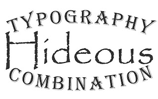
*This combo is actually on a restaurant menu in Apple Valley.
Wednesday, November 11, 2009
Final bus documents should be 6x4.25 inches at 300 dpi
Desaturate and Recolor: _____/20 Points
_____/ 10 points: Path on bus includes only items to be recolored and excludes items that should retain original color. Paths exclude areas such as the bus body, roof, hubcaps, headlights, taillights etc.
_____/ 10 points: Desaturated and recolored layers look realistic, and not superimposed.
Graphics: _____/20 Points
_____/ 10 points: A graphic from another source is applied to the bus.
Graphic appears to be a natural part of the bus paint, and not superimposed.
_____/ 10 points: Original photo background is no longer visible. Bus is in new environment.
Write-Up: _____/10 Points
1. Describe the steps you took to recolor the buses, add graphics and place them in a new environment.
2. How does the new environment relate to/enhance your bus designs?
3. Name what you feel is the most successful aspect of the work.
4. State one thing you would do differently if given the opportunity.
Paste your written response into a Photoshop document with your buses and turn in.
When finished, begin developing possible themes for your event invitation.
Develop HEADLINE and BODY COPY for invite. Review p. 8-11 in Basics of Design for tips on effective copywriting.
Select typefaces. Come up with three combinations in Illustrator. Save all in one Ai document. Review p. 242-248 for tips on combining type.
Each combo should represent two categories of type. (Serif, sans serif, decorative, script.)
Print and present to instructor.
BUS PROJECT
1. Make paths for all items to be desaturated or masked.
2. Desaturate. Image>Adjustments>Desaturate
3. Recolor--Pay attention to the MODE and OPACITY of both the BRUSH and the LAYER.
4. Add graphics via photos, scans, drawings, custom brushes or other image sources.
5. Add a layer mask to isolate van from background.
6. When done with all 3 angles, start thinking of new environments for your sweet vans.
Monday, November 9, 2009
VW BUS MAKEOVER
Step 1: Clip the buses.
Extract the buses and their shadows from the backgrounds of the photos. You will do this by creating PATHS that you manage in the PATHS panel in Photoshop. Paths are essentially a way to save selections so you can use them over and over again. There are 2 ways to create paths in Photoshop:
• By drawing paths with the PEN TOOL or the SHAPE tools in Photoshop.
• By creating a selection with the marquee, lassos, or magic wand and converting it to a path.
Thursday, November 5, 2009
PRIORITIZE!
Complete tasks in this order. Turn in as soon as you finish them.
1. Finish Chapters 10 + 11 in Basics of Design.
2. Finish Chapter 2 Illustrator vocabulary and tutorial.
3. Finish TYPE QUOTE, along with the write-up and matting.
4. Finish ONLINE TUTORIAL, along with its write-up.
DONE WITH EVERYTHING?
Set up an ONLINE PORTFOLIO at https://www.blogger.com/start
Friday, October 30, 2009
TYPE QUOTE PROJECT
Criteria:
1. Illustration must be a minimum 8.5 x 11 inches/CMYK color.
2. Quote must be approved by teacher prior to beginning. Come up with three before presenting.
•
•
•
3. Your poster must be created by combining at least three fonts, representing at least two categories of typefaces (Serif, Sans Serif, Decorative, Script.)
4. Incorporate at least 2 of the following type adjustments into your overall design:
Leading, Kerning, Tracking, Vertical Scale, Horizontal Scale.
5. You must use at least 2 of the following tools/techniques:
Area Type Tool / Type on a Path Tool / Vertical Type Tool / Adding Gradient to Text / Overlapping Objects / Creating a Drop Shadow via Copy & Paste in Back.
Thursday, October 29, 2009
Search for a Photoshop, Illustrator, InDesign, or other media tutorial online. (www.good-tutorials.com, www.photoshopcafe.com, Google search Photoshop Tutorials, etc). Students should complete the tutorial, print a copy of it and turn it in.
Additionally, you must write a brief summary of:
(a) The steps involved,
(b) What you learned,
(c) How you would use the skill in another project.
Additionally, you must write a brief summary of:
(a) The steps involved,
(b) What you learned,
(c) How you would use the skill in another project.
Tuesday, October 27, 2009
Here is your agenda for the day. Please note the sub has a required project when you finish your reading. I expect everyone to be working on this when I return.
1. Read chapters 10 & 11 in Basics of Design. Do the Mini quizzes provided.
2. Complete Chapter 2 Illustrator vocabulary and tutorials. Print tutorial with name on it when done.
3. Once you finish chapters 10 & 11 in Basics of Design and Chapter 2 Illustrator vocabulary and tutorials, staple them together and turn them into the basket.
4. The sub has a required assignment for when you finish. You will search for and complete a Photoshop or Illustrator tutorial, then do a short write up about it. Really try to find something you want to know more about and use this as a chance to get some hot skillz.
Here's your agenda for the day:
1. Finish and mat dingbat portrait, do write up and submit these with the rubric to the basket. More 2 sided tape is in the left hand cupboard by the PCs. If mat board runs out, just be ready to mat it when I get back.
2. Review Typenotes.ai in Stepstushare>Art Technology>Type Project>typenotes.ai if you were absent yesterday.
3. Read chapters 10 & 11 in Basics of Design. Do the Mini quizzes provided.
4. Complete Chapter 2 Illustrator vocab and tutorials. Print tutorial with name on it when done.
5. If you finish the Basics and Illustrator assignments, do not hand them in. Save them in your binder.
6. Work on something for another class or see the sub for a different activity.
7. If you had arranged to make up the test today, you can do it during class tomorrow. Be ready.
Wednesday, October 21, 2009
QUIZ REVIEW
Quiz on Friday, 10/23!
The quiz will consist of:
A. Multliple choice/matching items from your Photoshop/Illustrator vocabulary and lecture notes.
Photoshop Chapters: 3/Making Selections
4/Color Techniques
7/Working with Special Layer Functions
Illustrator Chapters: 3/Drawing and Composing an Illustration
B. Short answer/design activities from the Basics of Design textbook.
Ch 1: Before you begin to design
Ch 2: Emphasis
Ch 3: Contrast
Ch 4: Balance
Tuesday, October 13, 2009
PORTRAIT POINTERS:
1. Once you PLACE the portrait into your Illustrator document, make sure to put .25 inch guides around the outer portion of your project. Keeps you from having part of your portrait cut off when printing.
2. If you are having trouble identifying the main VALUE areas, select your picture and apply the CUTOUT FILTER to your picture. Problem solved.
3. You can hide the excess part of your image by applying a CLIPPING MASK to it. Learn more on pages 4-30 thru 4-35 of your Ai book
4. MAKE SURE TO LOCK THE TEMPLATE LAYER and start drawing on a different layer.
5. Keep each value on a separate layer.
6. Convert dingbats to outlines when sure you are done editing them. (Select items, go to TYPE>CREATE OUTLINES
7. Select a HUE for your MONOCHROMATIC color scheme.
8. Apply that HUE swatch to your dingbats.
9. Select all dingbats for any given shape, and the shape. Make sure the shape is the TOP OBJECT. (Object>Arrange>Bring to Front)
10. Apply the CLIPPING MASK. (Object>Clipping Mask>Make)
11. Adjust the VALUE of your shape by selecting the object and changing its TRANSPARENCY. (Window>Transparency)
12. Print your portrait when ready AND put a copy of the Illustrator file into the DROPBOX.
13. Do write-up in the SHARED Art Technology folder.
14. Mount the portrait on railroad board.
15. Turn in PORTRAIT, WRITE-UP and RUBRIC.
Monday, October 12, 2009
STARTING YOUR DINGBAT PORTRAIT
1. Take a picture of yourself using the Photo Booth application on the Macs.
2. Save the photo in your server folder.
3. Start a new Illustrator document. Letter sized, Portrait orientation.
4. Place guides .25" around the outside of your document, so you remember your print margins.
5. Go to File > Place. PLACE your photo file into the Illustrator document.
6. Experiment with the SCALE tool in Illustrator until your portrait fills the PICTURE PLANE of your document.
7. Make sure the photo is selected. Go to WINDOW > TRANSPARENCY. Dim your photo to about 50%
8. Name your layer with the picture in it TEMPLATE.
9. LOCK the TEMPLATE layer.
10. Start a new layer called PATHS or DRAWINGS or anything other than LAYER 2.
11. Print the dimmed portrait of yourself and try to split it into big SHAPES.
12. Identify at least 3 areas of VALUE in the SHAPES (lightest, darkest and at least one mid tone)-- creating a VALUE GUIDE to make your life easier when you begin working.
13. Use your VALUE GUIDE when you begin tracing shapes that outline important areas of your face.
14. When done, poke TEMPLATE layer in eye and just print your PATHS. Verify there are 4 clear areas of value.
15. If good, proceed to downloading dingbat fonts that represent you in some school appropriate manner.
Wednesday, September 30, 2009
1. Layout, Print, Mount Lenticular Image
A. Reduce your images to 6.5 X 6.5 inches.
B. Set up a Photoshop document that is 14 inches wide and 8.5 inches tall @ 150 dpi.
C. See http://photojojo.com/content/diy/how-to-make-lenticular-images/ for the splicing method.
D. Go to Select>All, then Edit>Copy Merged. Start a new layer and paste your copy there.
E. Save your Photoshop Document.
F. Go to File>Save As. Name the file LASTNAME_LENTICULAR. Select JPEG from the file type menu. Crank the JPEG quality slider over to 12.
G. Use the Crop tool to chop the extra inch off the top and bottom of your layout.
H. Save the JPEG again.
I. Place your JPEG in the Lenticular dropbox folder.
J. Attend a mounting demo.
2. Do Lenticular Image writing assignment:
Write a paragraph that answers the following questions:
A. How does your project CONCEPT represent the principle of CONTRAST?
B. Discuss how you used EMPHASIS, BALANCE and CONTRAST in your COMPOSITIONS.
C. Discuss your use of at least three of the Painting and Selection tools in Photoshop in your compositions.
(See the back side of your Movie Poster assignment sheet for the list.)
D. What makes your design different from others?
E. What would you do differently next time?
F. Attach bibliography to writing assignment and turn in to the basket.
Monday, September 28, 2009
CONTRAST LENTICULAR PROJECT
A lenticular composition consists of two separate images spliced together. The viewer will see a different image when looking at it from one angle than they will from the other. Check out how lenticulars are made at: http://photojojo.com/content/diy/how-to-make-lenticular-images/
So...The key to having a really cool lenticular image is having it feature two related, yet CONTRASTING images. An easy example of this is having it be about a life/death theme. In other words, showing an item in one state, then its destruction or transformation. Like cocoon to butterfly, or summer to winter, etc.
Your lenticular image can involve any school appropriate subject matter, so long as the conditions of CONTRAST are clear.
PROCESS:
1. BRAINSTORM: Select five themes your lenticular could feature.
2. SKETCH: Pick at least two of your themes to develop sketches of.
3. PRESENT: Show your sketches to me and explain your ideas. You must receive my approval before you begin working on the final project.
4. BEGIN WORKING.
Thursday, September 17, 2009
FRIDAY, SEPTEMBER 18
Work on the following, in order:
1. Chapters 4, 6 and 7 Photoshop vocabulary and skill textbook activities
2. Movie Poster Assignment.
Staple the vocabulary and skill tutorials from each chapter together, then turn into the basket on my desk. Get the movie poster assignment sheet from the sub after you have submitted all of the chapter work.
Read below for a summary of the movie poster assignment and relevant Internet links.
POSTER PROJECT
Your task is to create a movie poster. The poster must be made in the style of a real movie theater poster. The movie represented in your poster must be of your own creation. Do not make a poster for an existing movie.
GENRE: ACTION.
GOAL: To inform people about and convince them to see the movie.
AUDIENCE: PG-13 moviegoers.
EXISTING SAMPLES: http://www.movieposter.com/ Look at a bunch of action movie posters. Try to identify the point of emphasis, and the secondary/tertiary accents in the VISUAL HIERARCHY of the design. Think about how you will achieve this in your design.
POSTER CRITERIA:
1. 11 x 17 inches @ 150 Dpi.
2. Clear VISUAL HIERARCHY. (There should be a point of emphasis, and secondary/tertiary accents.
3. Use at least TWO tools from each category of the Photoshop painting and selection tools listed on the assignment sheet.
4. Your poster must incorporate a minimum of 5 separate images that have been worked into a cohesive image in Photoshop. You must include a movie title and other relevant movie text information.
5. Images must be public domain, creative commons licensed, or under your copyright, or copyright that someone has authorized for your use. Here are some good links for acceptable images:
http://www.everystockphoto.com
http://www.sdst.org/shs/library/cfimages.html
http://search.creativecommons.org/
http://freeres.info/
6. You MUST include a bibliography of your image sources with your final design. Keep track of the websites you are getting images from by pasting links into a Word document.
7. Each person in class must produce their own poster. People may work in groups to come up with an action movie concept and title, and work together to find a nice collection of source images, but each person in the group must produce their own poster.
Monday, September 14, 2009
1. Sewing Box Tutorial (Pages 3-7 to 3-23)
Use the following tools to select each item:
Tape Measure: Marquee
Pincushion: Magic Wand
Thimble: Magic Wand
Thread: Color Range Selection
Scissors: Color Range Selection
2. Project Builder 1: Page 3-26. You can choose to work with the elderly lady on the tutorial page OR follow the same steps and work with ProActivMan.jpg, available in the Shared Art Technology folder on the STEP server.
Friday, September 11, 2009
TECHNOLOGY ANALYSIS
Groups of 3 or 4
Compare and contrast technology of 1988 with technology of today.
1. Given the tools designers had to work with, give your opinion of the animations in the video.
ie 3 second Pixar spot vs Pixar movies of today.
2. Something like a paragraph where you compare and contrast 3 or 4 technologies you find have advanced the most. Support your findings with images, etc.
Thursday, September 10, 2009
EMPHASIS AD ANALYSIS
1. Examine a variety of magazine advertisements.
2. Identify their GOAL and AUDIENCE.
3. Select two ads with really different goals and audiences (ads that target two separate DEMOGRAPHICS).
4. Place them on a sheet of drawing paper.
5. Identify the points of EMPHASIS in each ad. Clearly mark them on your layout.
6. Explain in 1-2 sentences why you think the ads use (or do not use) emphasis well. Bonus points if you can identify how other elements and principles of design are used in the ad.
7. State which demographic you think the ad is targeting. Do you think the ads are effectively reaching the demographic they hope to target? Explain why or why not in 1-2 sentences.
Wednesday, September 9, 2009
Tuesday, September 1, 2009
WHAT IS ART TECHNOLOGY?
Art Technology is the tools people use to develop print and interactive media.
A variety of careers exist that utilize art technology in a variety of ways. Students completing this course will develop skills which will familiarize them with computer software and studio equipment used in the Arts, Communications and Information Systems career field. More information on art technology based careers can be found at: http://www.mnvu.org/careers/arts.html
What is a Graphic Designer?
One of the most commonly known art technology careers is graphic designer. A Graphic designer works for a bunch of different businesses, organizations and people we call clients. Each client needs to communicate a certain message to certain people we call the target audience.
Graphic designers fulfill this need by creating print media like posters, logos, book covers and package design. But because technology is ever-changing so are the "things" the graphic designers are creating. Take, for example, the explosion of interactive media content being developed, such as video, games, and websites.
To learn more about graphic design, visit http://whatintheworld.aiga.org/
Friday, June 5, 2009
SENIOR FREE DANCE PARTY
Follow these links for directions to projects:
1. Photo Cube 6 Theme Based Images = 1 Rockin objet d'art!
Your Choice: Six of Your Own Altered Photos
Or
Your Favorite Song in Six School Appropriate Panels
2. If/when you finish your photo cube, you can make another
Lenticular Image * I know we already did this, but it's fun.
Show the same object in two different states (My cat as a Muppet and as a Lion)
Show a pair of objects (Hall & Oates)
Show a set of opposites (Day & Night, Good & Evil, Man & Woman, etc.)
Tuesday, June 2, 2009
Tuesday, June 2
1. Follow the proofreading and printing instructions in the post below this one. All workbooks are due today. See me when you are ready to use the comb binder. Turn in the proofread mini copies along with your full-sized workbook. Only print in color if you plan to keep the workbook. Print in greyscale if you plan to recycle.
2. Fill out and turn in the partner evaluation form.
Evaluate only the people from this class that were in your group.
3. Find and review all MINI QUIZ worksheets in preparation for the OPEN NOTE FINAL we are having on Wednesday.
4. Report to Forum A&D at 9:15 if you are participating in Senior Recognition tonight.
Monday, June 1, 2009
PRINTING YOUR WORKBOOK
1. Print a condensed copy of your workbook.
File>Print
Click on SETUP.
Click on THUMBNAILS. Select the 2x2 PER PAGE option.
2. Have 2 people from different groups proofread your workbook. Have them initial it.
3. Make necessary corrections.
4. Print final copies.
File>Print
Remove settings for printing the condensed copy, if necessary.
Click on General.
Click on REVERSE ORDER.
Select ODD PAGES ONLY under the SEQUENCE tab.
5. See me for instructions on comb binding your finished product.
6. Turn in your workbook, along with proofread pages. Make sure your name is on the project in some manner.
Tuesday, May 26, 2009
ADOBE SOFTWARE, THE WORKBOOK and YOU
1. Finish filming and photography if necessary.
2. Begin selecting/preparing photos for layout in Photoshop--Think in terms of creating PATHS to isolate SELECTIONS--it is essential to making your document work properly in InDesign for PATHS to be present.
3. Set up your InDesign document. File>New>Document. # of pages = 10. Make sure the FACING PAGES box is checked. Letter sized document. Portrait orientation.
4. Create graphics in Illustrator.
5. Select a HEADLINE typeface (can be flashy) and a BODY COPY typeface (should be serif or sans serif).
Monday, May 18, 2009
SCRIPT/STORYBOARD/COPYWRITING SESSION
1. You must get your SCRIPT/COPY and STORYBOARD approved before you can begin filming. Themes must be school appropriate. If anything is not done to criteria, it will be given back to you for revision.
2. Each subgroup (people assigned to work on a single problem) is responsible for the following items:
A. SCRIPT: Must be typed and properly formatted (includes all speaking parts, location descriptions, camera shots, and stage directions.)
B. COPY: The copy is the script, altered for use in the workbook. It must also be typed. The procedure for solving the problem should be clearly described while using the theme from the script.
C. STORYBOARD: Scene storyboard should consist of at least eighteen panels. This is a minimum of three storyboard worksheets per subgroup. A minimum of four different camera angles should be featured in your storyboard. See the sheet for details.
Wednesday, May 6, 2009
Logo/Business Card Questions: Balance and Repetition
1. What type of balance does your logo have?
2. Name at least two types of repetition listed on page 126 of Basics... that can be seen in your business card design.
3. How will you carry the balance and repetition you have established here into your letterhead and envelope?
1. What type of balance does your logo have?
2. Name at least two types of repetition listed on page 126 of Basics... that can be seen in your business card design.
3. How will you carry the balance and repetition you have established here into your letterhead and envelope?
Monday, May 4, 2009
Independent Study Q4 Grades
7 tasks:
1. Journal/Sketch (10 points, 5pt for journal entry, 5 pt for sketch.)
2. Journal/Sketch (10 points, 5pt for journal entry, 5 pt for sketch.)
3. Images/Artists/Techniques (15 pts, 5/image, 5/artist, 5/technique)
4. Images/Artists/Techniques (5 pts, your choice of 1 category.)
5. Project Proposal (10 pts--tell me 200 pts worth of project and criteria.)
6. 3 questions for Chris Huntress--written on paper.
7. 1 question to Chris Huntress verbally.
Friday, May 1, 2009
Logo Thumbnails
When presenting your thumbnails for approval, be able to do the following:
1. Explain how each of your sketches combine at least 3 ideas from your concept board.
2. Discuss how each of your sketches incorporate at least 3 grid structures.
After receiving approval:
1. Scan your 2 or 3 best sketches into the computer.
2. Start looking at and learning some of the Illustrator techniques listed on the assignment sheet. Decide which you will apply to your logo design. If you are already familiar with some of the techniques listed, try to work with others.
3. Place your sketches in an Illustrator document and reduce their transparency to 50%.
4. Begin drawing the logos in Illustrator on separate layers, using the pen and shape tools.
5. Enhance the basic form of the logos through experimenting with applying the new techniques to the designs.
Thursday, April 23, 2009
Typography Test Review
This is what you need to know for the typography test, and where to find it:
World of Letterforms Video:
1. What the letter A originally symbolized
2. Who invented moveable type & what they created with it
3. What did Mantius create and why?
4. What did Bodoni, Garamond, Baskerville & Benquiat create?
In your typography packets:
1. Type measurement conversions: Points>Picas / Points>Inch / Picas>Inch
2. How to measure LEADING
3. How to measure the line length of different text alignments (Examples A-E)
4. How to use the E-Gauge to measure type
In Basics of Design: Layout and Typography for Beginners
1. 4 Things to Know before starting a design: Page 2
2. Graphic Design Principles: P 12-14
3. Graphic Design process: P 14-19
4. Different text alignments: P 101-104
5. Type Anatomy: P 205 (baseline, ascender, serif, counter, descender, x height, crossbar, cap height)
6. Vocabulary: Thumbnail, rough, comp, alignment, format, visual hierarchy, grid, serif, sans serif, decorative, script.
Miscellaneous online info:
1. How LEADING got its name: http://lowendmac.com/designer/11.html
Business Card Thumbnails:
In creating our business card thumbnails, we will focus on the design principles of EMPHASIS, CONTRAST and ALIGNMENT. You will set up an InDesign document and apply these principles to your experimenting with typography options for your identity system.
1. Create a Portrait oriented Letter sized document in InDesign, with 0.6 inch top and bottom margins and 0.5 inch inside and outside margins.
2. Create guides at the following locations.
Use the X and Y dialogue boxes at the top of your screen to enter the numbers:
X coordinates-- 0.5, 4, 4.5, 8
Y coordinates--0.6, 2.6, 3.2, 5.2, 5.8, 7.8, 8.4, 10.4
3. Label this layer "Guides". Lock the layer.
4. Start another layer. Label it "Thumbnails."
4. On the second layer, make a Rectangle (the tool without the x inside the shape) measuring 3.5 x 2 inches. Place it at x0.5/y0.6, using the X and Y dialogue boxes at the top of your screen to enter the numbers.
5. Begin experimenting with the fonts you used in your concept board. Develop eight possible typographic solutions in the business card spaces. Each solution should address the following design principles. Indicate what you have applied and where on your printed thumbnail sheet.
EMPHASIS: There should be a clear visual hierarchy in the design. (A strongest point of emphasis, backed by secondary and tertiary accents.)
CONTRAST: Apply contrast to the styles of type in your design and your color choices. Try combining a decorative or script font with a serif or sans serif font in each solution. Try combining regular and bold type, etc. Be sure that whatever choice you make, that the type retains LEGIBILITY. Experiment with contrasting colors, in the type and background colors.
ALIGNMENT: Use the Paragraph panel to try out different type alignments in your thumbnails. Experiment with each alignment style (Left, Center, Justified, Right) at least one time. Think about where your logo would fit on the card once it is developed.
6. Your business card should list the following information:
FIRST AND LAST NAME
JOB TITLE
COMPANY
1234 YOUR STREET
ANYTOWN, MN, 55555
(555) 555-5555
PROFESSIONAL_EMAIL@ANYCO.com
Friday, April 17, 2009
Independent Study 4/17/09
1. Pick up your journals from the table. Fix them if incomplete. Leave them in the same location at the end of the day if you are re-submitting them. I did not receive assignments from Cody or Jerry and Will was absent yesterday. Flag the Tuesday and Thursday pages and turn in today!
2. NO DARKROOM OR SCREEN PREP STUFF TODAY!
Chemicals make me nervous. I want to be here. End of story.
3. In the meantime, work on current projects, Q4 project ideas, criteria, etc. Be ready to go over it with me on Monday! You can also knock your next week journal assignments out of the way.
4. You can still have a long break today BUT YOU CANNOT TAKE IT AT THE END OF CLASS. The cafeteria closes at 1:00 on Fridays anyway. If you want to go there, go at like 12:25. THE SUB CANNOT DISMISS YOU FROM THE COMMONS. End of story.
4. Yep, the new printer is here. But it is not up and running yet. To touch is to die!
Tuesday, March 17, 2009
INDEPENDENT STUDY: EPIC SKETCH-SOURCE BOOK/JOURNAL THINGY
We will divide our course binder into a few sections, thereby converting it to an EPIC SKETCH-SOURCE BOOK/JOURNAL THINGY!
Here it goes:
1. Calendar
2. Journal: Reflection + Progress
3. Sketchbook
4. Source Images
5. Facts about artists/companies, etc.
6. Techniques and processes.
We will divide our course binder into a few sections, thereby converting it to an EPIC SKETCH-SOURCE BOOK/JOURNAL THINGY!
Here it goes:
1. Calendar
2. Journal: Reflection + Progress
3. Sketchbook
4. Source Images
5. Facts about artists/companies, etc.
6. Techniques and processes.
Dingbat Self Portrait Rubric
1. Portrait is composed of 4 distinct values:
*Darkest shadow, dark mid-tone, light mid-tone, and white space. Values are appropriately balanced in relationship to one another.
2. Portrait is broken into clean, smooth paths.
*Student took great care in creating the paths. Lines are curved and straight where appropriate. Paths do not look 'choppy'.
3. Paths are used to create clipping masks.
*Clipping masks serve as a boundary for the dingbat shapes, keeps them contained, establishes the form for that part of the portrait.
4. Dingbats have been scaled, rotated, etc. Effort was taken to make them fit together like the pieces of a puzzle. There is a distinct visual texture as a result.
5. A variety of dingbats have been used.
*At least three fonts are incorporated into your design.
6. Thorough write up--details to come.
Expect to discuss work process, covering the criteria points.
Thursday, March 12, 2009
Dingbat Portrait Info
For our next project, we will tackle a challenging art task for any medium: Portraiture. The fun and funky part of our portrait is that it will be a way for us to explore a really cool aspect of type: DINGBATS!
Wikipedia says: http://en.wikipedia.org/wiki/Dingbat
A dingbat is an ornament, character or spacer used in typesetting, sometimes more formally known as a "printer's ornament" or "printer's character".
The term continued to be used in the computer industry to describe fonts that had symbols and shapes in the positions designated for alphabetical or numeric characters.
Check out this website for some examples of dingbat portraits:
http://www.walyou.com/blog/2009/01/05/creative-singers-ad-bose-sound-system-designs/
Anyway, the first steps to achieving this portrait are to:
1. Learn a little bit about shading, value and abstraction. Follow the links below for some reading on this topic.
http://www.portrait-artist.org/basics/shading.html
http://www.portrait-artist.org/basics/shading-explained.html
2. Start finding some rad dingbats to fill your different value areas. Download the fonts, save the type files in your server folder, and install them in the Fonts folder in your Control Panel.
Search for dingbat fonts that represent your personality here:
http://www.dafont.com/
http://freeres.info/free-fonts.php
Tuesday, March 10, 2009
Project Proposal Questions
When doing a proposal it is important to anticipate the questions the person you are presenting to will have, so you have the answer when they ask.
Try to find an answer for the following questions. Remember, as you develop the pitch, make sure that each person is making a contribution to the presentation.
1. What’s in it for me?
2. How much is it going to cost?
3. How will it help future classes/STEP/advance the program?
4. How many places to order from?
5. How do you expect to achieve your goals?
6. Who will it benefit?
7. What will you need besides the supplies you are requesting? (space, facilities, time, access)
8. How long will it take?
9. When will you need the supplies by?
10. Is it school appropriate?
11. Are there safety issues?
12. Legal issues?
13. How do expect to manage your materials (clean up after yourself)
14. Are your materials necessary? What’s the point of getting them?
15. What’s your plan B? Do you have a plan B?
16. Relationship to Art Technology?
17. How will it get to your end user—get people to care about/use your product?
18. Why are you doing this?
Tuesday, February 24, 2009
Type Nameplate File Prep and Print
To Prepare Your Files:
1. Make sure each of your letter panels is FLATTENED (Layer>Flatten Image) and saved as a JPEG or TIFF.
2. Create NEW Document: Width 11 inches, height 8.5 inches.
3. Set to 150dpi/CMYK Color
4. Place X Coordinate Guides at: 0.25, 5.25, 5.75 and 10.75 inches.
5. Place Y Coordinate Guides at: 1.75 and 6.75 inches
6. Insert two of your designs in the squares created by the guides. (File>Place>file.jpg)
7. Merge your placed designs into one layer.
8. Poke layer in eye and repeat steps 1-6 for remaining designs.
To Print Your Files:
1. When ready to print, turn on the layers one at a time. Change the following settings:
A. Activate the layer you wish to print. The layer you don't want to print gets poked in the eye.
B. File>Page Setup>Legal Size, Landscape Orientation.
C. When printing, make sure to put Legal size paper in the printer. Take it from the ream on the windowsill by the printer.
Friday, February 20, 2009
INDEPENDENT STUDY: Project Proposals
Your digital art projects will involve some collaboration with your colleagues.
Basically, your goal is to make something, and it must encompass some independent research and learning in order to be able to complete your project. If nothing else, the collaboration is in the research of techniques. You will eventually teach the class the techniques you research. Develop the following project proposal with your partners. Yes, the partnership is required.
1. What do you want to make?
2. What do you need to learn in order to do it?
3. How long do you think the learning will take?
4. How will you show the class what you learned?
5. What materials will you need?
6. How will you get the materials?
7. How long do you think the project will take?
8. Who will you be working with?
Type Designs: Nameplate
1. Create a design using the letters of your name
(first, last, nick, initials, family or friend)
2. At least three panels measuring 5x5 inches @ 150 dpi.
Each panel will be a different letter of your name.
3. Each panel should feature a pattern created by the combination of at least two categories of typefaces (Serif, Sans Serif, Decorative, Script) Use the letters to create different shapes that form positive and negative spaces.
4. Incorporate at least two of the following type adjustments into your design: Leading, Kerning, Tracking, Vertical Scale, Horizontal Scale.
5. Incorporate at least two Layer Styles into your final work.
Tuesday, February 17, 2009
INDEPENDENT STUDY: TUESDAY, 2/17
1. Work in groups on your radio and coffee projects.
2. Develop a set of comps--which must include at least 1 contribution from each group member--to present to your client.
3. Show comps to Mrs. Arnold if you finish. Print and mount, etc.
4. Learn something: www.good-tutorials.com
5. Everyone should be doing something; no one should be doing nothing.
Friday, February 13, 2009
ART TECHNOLOGY TUESDAY 2/17
1. Layout, Print, Mount Lenticular Image
A. Reduce your images to 6.5 X 6.5 inches.
B. Set up a Photoshop document that is 14 inches wide and 8.5 inches tall @ 150 dpi.
C. See http://photojojo.com/content/diy/how-to-make-lenticular-images/ for the splicing method.
D. Print the spliced document.
E. Fold and Mount!
2. Do Lenticular Image writing assignment:
Write a paragraph that answers the following questions:
A. How does your project represent the Life/Death concept?
B. Discuss how you used at least three of the Design Components listed below in your compositions. (Color, Contrast, Unity, Emphasis, Appropriation, Space, Time)
C. Discuss your use of at least three of the Painting and Selection tools in Photoshop in your compositions.
(See the Word document (Selecting and Painting Tools.doc) in the Shared folder for a full list.)
D. What makes your design different from others?
E. What would you do differently next time?
3. Do the Chapter 5 Photoshop vocabulary and lesson.
Thursday, February 12, 2009
INDEPENDENT STUDY: List of everything we have done so far.
Review this list and make sure you have completed each item.
I am currently working up a reflection/critique thing so we can discuss all this and make me able to grade it. See me if you have any questions regarding these assignments.
Projects done by all:
1. Portfolio Pages
2. Advocacy Day Posters
3. CTE Week Flier
Group Projects:
1. Cookie/Candy: A.J., Jake, Kayla, Noah
2. Trivia Contest: Cody, Ashley,Will
3. Bakery Menu: Brittany, Melissa, Dylan, Jerry
Current Tasks:
1. STEP Radio logo/identity: Noah, Jake, Dylan, Melissa, Jerry, Will
2. Coffee/Fashion: A.J., Cody, Ashley, Brit, Kayla
Wednesday, February 11, 2009
Monday, February 9, 2009
MONDAY FEBRUARY 9
1. Finish Binder Pages assignment.
2. Review pages against assignment rubric; fix if they do not meet the criteria.
3. Do the writing portions of the assignment. Be sure to type and spell check your paragraphs. They do not pay me enough to read sloppy cursive!
4. Print extra copies of your Binder Pages, attach to your written portions and rubric and turn in to the basket.
5. You can do a variety of things when you finish, including:
A. Helping others with their assignment.
B. Studying for the Chapters 2-7 quiz (Quiz is on Wednesday, Feb 11!)
C. Client Projects--See me for assignment and details.
D. Learn something on www.good-tutorials.com
*Note on options C and D: Save all extra items you create in a folder on your server. Once completed, print and attach a brief summary of what was learned and how it was done and submit for extra credit. You must have all assignments turned in to qualify for extra credit.
6. This list of tasks is enough to keep every person in this room busy. In other words, everyone should be doing something, no one should be doing nothing!
Thursday, February 5, 2009
INDEPENDENT STUDY: Candy and Cookies n stuff OH MY!
OK--Here is the Lowdown on our tasks for today:
1. Team Bakery: Work as a team to put together at least two simple classy designs for the Prostart competition menu.
2. Team Trivia: During CTE week, there will be daily trivia questions that are attached to FABULOUS PRIZES. They of course relate to Career and Technical Education.
Come up with at least two designs to promote the trivia contest. This can be really obnoxious and over the top. Play with color and character. w00t!
3. Team Candy + Cookie Dough: Skills USA is selling Candy Grams Monday through Wednesday--Noah should have the deets. Various CTSO's will sell cookie dough throughout the week. Here is the breakdown:
COOKIE DOUGH FOR SALE!!!: Various student organizations will be selling cookie dough next week during CTE week. The cookie dough will be sold Monday through Friday in the first floor commons area. A box of cookie dough is $16.00; please have your cash or a check made out to STEP ready when purchasing the cookie dough. All the proceeds will go to help pay for students who go to nationals. The various organizations that will be selling the cookie dough are:
Monday: All CTSO's (FCCLA/HERO, HOSA, FFA, Skills USA)
Tuesday: FCCLA/HERO
Wednesday: HOSA
Thursday: FFA
Friday: Skills USA
This is also an opportunity for you to learn more about the student organizations that are offered here at STEP.
Copyright Infringement or Fair Use?
Check this out! Teachable moments yo!
http://news.yahoo.com/s/ap/20090204/ap_en_ot/obama_poster
Wikipedia's take on Copyright:
http://en.wikipedia.org/wiki/Copyrights
Check this out! Teachable moments yo!
http://news.yahoo.com/s/ap/20090204/ap_en_ot/obama_poster
Wikipedia's take on Copyright:
http://en.wikipedia.org/wiki/Copyrights
Wednesday, February 4, 2009
INDEPENDENT STUDY: CTE WEEK PROPAGANDA/PART 2
The main point of CTE Week is to create awareness of technical careers and our Career and Technical Student Organizations (eg FCCLA/HERO, Skills USA, FFA and HOSA.)
Part of this shameless promotion is selling sweet, delicious candy. So we need to make signs that promote the sweet, delicious candy. Each day the sales will benefit a different Career and Technical Student Organization.
On Friday, all STEP students will attend a Career Exploration Session at Anoka Technical College. Here you will learn about possible majors at ATC and possibly receive more sweet, delicious candy and pencils.
Here is the list:
Monday 2/9: Overview of Career and Technical Student Organizations (FCCLA/HERO, HOSA, FFA, SKILLS USA)
Tuesday, 2/10: FCCLA/HERO Day
Wednesday, 2/11: HOSA (Health Occupations Students of America)Day
Thursday, 2/12: FFA(Future Farmers of America) Day
Friday, 2/13: Career Exploration Session at Anoka Technical College and Skills USA day.
Everybody must make a flier. These will be hung in the stairwells and whatnot. Ms. Moore will pick one to be made into a banner that will hang in the first floor commons. This assignment is due by 1:00 PM Thursday February 5.
Tuesday, February 3, 2009
INDEPENDENT STUDY: CTE Week Fliers & Banner
Next week (February 9-13) is CTE (Career and Technical Education) Week here at STEP. The Student Ambassadors have picked various theme days that they would like to have next week. You get the fabulous cultural experience of creating fliers and posters to promote it!
The theme days they picked are:
-Monday 2/9: Pajama Day
-Tuesday 2/10: Clash Day
-Wednesday 2/11: Dress-up Day
-Thursday 2/12: Retro Day
-Friday 2/13: Career Day
Everybody must make a flier. These will be hung in the stairwells and whatnot. Ms. Moore will pick one to be made into a banner that will hang in the first floor commons. This assignment is due by 1:00 PM Wednesday Feb 4.
Monday, February 2, 2009
CHAPTER 4 PHOTOSHOP LESSONS
The tutorials in Chapter 4 don't tell me a lot if you just show me the final one.
I have split your tasks into eight computer files. (Four files for Lesson 4-1 and four files for Lesson 4-2) You will save paper by printing each group of lessons on one sheet via the File>Automate>Contact Sheet II command. To do this, you must save each group of lessons in a separate file folder.
Here is the page number list of the lessons:
Lesson 4-1
Part A: 4-7 through 4-15
Part B: 4-16 through 4-19
Part C: 4-29
Part D: 4-30 through 4-31
Lesson 4-2
Part A: 4-22 through 4-23
Part B: 4-24 through 4-28
Part C: Use the Image>Adjustments>Match Color command to change the background green, just like on the rooster eye in Lesson 4-1, Part D.
Part D: Use the Image>Adjustments>Match Color command in a different way here. Create a layer that is half red, half green in your finished 4-2, Part C document. Go to the Match Color command. Your SOURCE is your Part C document. Make sure you have the red & green layer listed in your LAYER menu underneath the SOURCE menu. Crank the sliders til you have adjusted the color levels to your liking. Feel free to experiment with other color combos besides red/green here. Be sure to save this as PART D when you are finished.
INDEPENDENT STUDY: ADVOCACY DAY POSTERS
Task:
Create posters they can use for Advocacy Day at the State Capitol.
What is Advocacy Day?:
The Student Senate is going to the Capitol to represent those who pay tuition at a MNSCU school and/or the University of Minnesota The current legislative session has big plans for cutting k-16 funding. The ATC Student Senate is particularly interested in maintaining funds for the 13-16 portion. If the legislature cuts 13-16 funding, it results in tuition hikes, which is resulting in a disproportionate debt to earnings ratio for graduates.
What You're Gonna Do:
Create a slogan and illustration for a poster design.
When's it Due?:
You should have a mock-up printed by the end of the day on Friday, February 6. ATC Student Senators are coming back on Monday February 9.
Student Senate Website: www.mscsa.org
Thursday, January 29, 2009
Independent Study -- Upcoming Client Projects
Friday Consultations:
A. JOB FOR MR. BARTSH!
B. ATC Student Senate special event materials
1. STEP yearbook sales campaign.
2. STEP bakery menus.
3. STEP Fashion and Cosmetic careers items.
4. Ms. Lipa business cards
5. TC Derby Tots logo. (kids + roller derby = ADORABLE! C'mon--you know you want to make a logo of a tater tot on roller skates.)
6. STEP Investigating Medical Careers class logo.
7. CPHS tennis tournament: Things with Strings: A Round Robin Classic
8. STEP Student Radio
Wednesday, January 28, 2009
Chapter 3 Photoshop Tutorials:
You will use a variety of tools in Chapter 3.
They include:
1. Selection(marquees, lassos, magic wand, color range),
2. Sampling (healing/spot healing brush, and layer masks) and
3. Organizational (guides, snap and x/y coordinates)
The tutorials involve assembling a sewing box and retouching a photo.
NOTES:
1. Do not use the Quick Selection tool on page 3-15.
Select the background with the magic wand and invert your selection instead.
2. For the activity on Page 3-26, you can choose to work with the elderly lady on the tutorial page OR follow the same steps and work with this ACNE VICTIM
Be sure to attach a printed copy of your Chapters 2 and 3 lessons to your vocabulary sheets and turn them in to the basket by the end of class today.
Independent Study: Portfolio Decoration.
Your portfolio is boring, yo. Time to zest that up. Here's how:
1. Create a document for your spine piece in the program of your choice, measuring 2.25 x 10 inches @ 150-300 dpi. When done, save it as a PDF.
2. Start a letter sized InDesign document, with 3p0 margins. Switch both rulers to inches right away. Then set guides at the following X coordinates: .5, 2.75, 3.125, 5.375, 5.75, 8.0
3. Create a picture holder box (aka the box thingy with the x in it in your tools) 2.25 x 10 inches--whoa! That's the same size as your spine piece!
4. Select your picture holder. File>Place>your_awesome_spine_art.pdf
5. Duplicate the magic two times by holding the alt key. w00t!
6. Create radtacular front and back pieces in the program of your choice. Letter sized(8.5 x 11), again @ 150-300 dpi if applicable. Zang!
Friday, January 23, 2009
Monday, January 12, 2009
Copyright Friendly Images
Don't just go online and start picking out any old picture for your Self Promotion Project! You just may end up with some copyright or plagarism problems!
To avoid such issues--only search where you know it's all good. Here are some websites full of OK images.
Creative Commons:
http://search.creativecommons.org/
Other Copyright Friendly Sites:
http://www.sdst.org/shs/library/cfimages.html
Better yet, use your own drawings or photos as an image source!
Thursday, January 8, 2009
Typography Test Review
This is what you need to know for the typography test, and where to find it:
World of Letterforms Video:
1. What the letter A originally symbolized
2. Who invented moveable type & what they created with it
3. What did Mantius create and why?
4. What did Bodoni, Garamond, Baskerville & Benquiat create?
In your typography packets:
1. Type measurement conversions: Points>Picas / Points>Inch / Picas>Inch
2. How to measure LEADING
3. How to measure the line length of different text alignments (Examples A-E)
4. How to use the E-Gauge to measure type
In Basics of Design: Layout and Typography for Beginners
1. 4 Things to Know before starting a design: Page 2
2. Graphic Design Principles: P 12-14
3. Graphic Design process: P 14-19
4. Different text alignments: P 101-104
5. Type Anatomy: P 205 (baseline, ascender, serif, counter, descender, x height, crossbar, cap height)
6. Vocabulary: Thumbnail, rough, comp, alignment, format, visual hierarchy, grid, serif, sans serif, decorative, script.
Miscellaneous online info:
1. How LEADING got its name: http://lowendmac.com/designer/11.html
This is what you need to know for the typography test, and where to find it:
World of Letterforms Video:
1. What the letter A originally symbolized
2. Who invented moveable type & what they created with it
3. What did Mantius create and why?
4. What did Bodoni, Garamond, Baskerville & Benquiat create?
In your typography packets:
1. Type measurement conversions: Points>Picas / Points>Inch / Picas>Inch
2. How to measure LEADING
3. How to measure the line length of different text alignments (Examples A-E)
4. How to use the E-Gauge to measure type
In Basics of Design: Layout and Typography for Beginners
1. 4 Things to Know before starting a design: Page 2
2. Graphic Design Principles: P 12-14
3. Graphic Design process: P 14-19
4. Different text alignments: P 101-104
5. Type Anatomy: P 205 (baseline, ascender, serif, counter, descender, x height, crossbar, cap height)
6. Vocabulary: Thumbnail, rough, comp, alignment, format, visual hierarchy, grid, serif, sans serif, decorative, script.
Miscellaneous online info:
1. How LEADING got its name: http://lowendmac.com/designer/11.html
Wednesday, January 7, 2009
Self-Promo Project
Follow this link: 8 Tips and Tricks from the Self-Promo Pros
Cool tips on how to get started, what to think about and some crazy fun sidebars, like a website that allows you to generate a free font, and a link to downloading a pattern for a paper purse!
Follow this link: 8 Tips and Tricks from the Self-Promo Pros
Cool tips on how to get started, what to think about and some crazy fun sidebars, like a website that allows you to generate a free font, and a link to downloading a pattern for a paper purse!
Monday, January 5, 2009
Subscribe to:
Posts (Atom)