Critique Assignment
1. Open CRITIQUE_ASSIGNMENT.doc in the Shared Art Technology folder.
(STEPstushare > Art Technology > CRITIQUE_ASSIGNMENT.doc)
2. Reflect on your work thus far. Select two questions on the list to respond to. Make sure you include the requested Design Components and follow paragraph formatting.
3. Like with the bus project, paste a copy of your image and its critique response into a Letter sized InDesign document. Then export the file to a PDF (File > Export).
4. Place a copy of the PDF in the Critique folder in STEPstudrop
5. We will review these in class Tuesday 11/24.
Thursday, November 19, 2009
Invitation Printing Prep
1. Prepare your InDesign file.
2. Hide the "Back" layer.
3. File>Export>lastname_inviteFRONT.pdf
4. Hide the "Front" layer.
5. File>Export>lastname_inviteBACK.pdf
6. Put both PDFs in a folder titled lastname_invite
7. Put folder in the Event Invitiation folder on STEPstudrop
Invitation Write-Up
1. What is your event theme? Where did you get the idea? Is this an invite you could actually use?
2. Which typefaces did you use for the headline and body copy?
What categories of type do they fall into? (Serif, sans serif, decorative, script)
3. Did you make any type adjustments? (leading, kerning, tracking, vertical scale, horizontal scale) Where can they be seen?
4. What type alignment scheme(s) did you use? (flush left, flush right, centered, justified, asymmetric, concrete) Where can they be seen?
5. What do you like best about your invitation?
Tuesday, November 17, 2009
TYPOGRAPHY ABUSE
Papyrus + Algerian = Don't go there!
In addition to not looking good together at all, these typefaces are both decorative and compete for attention with one another. A great example of why you should stick to the Decorative or Script + Serif or Sans Serif formula!
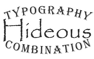
*This combo is actually on a restaurant menu in Apple Valley.
Wednesday, November 11, 2009
Final bus documents should be 6x4.25 inches at 300 dpi
Desaturate and Recolor: _____/20 Points
_____/ 10 points: Path on bus includes only items to be recolored and excludes items that should retain original color. Paths exclude areas such as the bus body, roof, hubcaps, headlights, taillights etc.
_____/ 10 points: Desaturated and recolored layers look realistic, and not superimposed.
Graphics: _____/20 Points
_____/ 10 points: A graphic from another source is applied to the bus.
Graphic appears to be a natural part of the bus paint, and not superimposed.
_____/ 10 points: Original photo background is no longer visible. Bus is in new environment.
Write-Up: _____/10 Points
1. Describe the steps you took to recolor the buses, add graphics and place them in a new environment.
2. How does the new environment relate to/enhance your bus designs?
3. Name what you feel is the most successful aspect of the work.
4. State one thing you would do differently if given the opportunity.
Paste your written response into a Photoshop document with your buses and turn in.
When finished, begin developing possible themes for your event invitation.
Develop HEADLINE and BODY COPY for invite. Review p. 8-11 in Basics of Design for tips on effective copywriting.
Select typefaces. Come up with three combinations in Illustrator. Save all in one Ai document. Review p. 242-248 for tips on combining type.
Each combo should represent two categories of type. (Serif, sans serif, decorative, script.)
Print and present to instructor.
BUS PROJECT
1. Make paths for all items to be desaturated or masked.
2. Desaturate. Image>Adjustments>Desaturate
3. Recolor--Pay attention to the MODE and OPACITY of both the BRUSH and the LAYER.
4. Add graphics via photos, scans, drawings, custom brushes or other image sources.
5. Add a layer mask to isolate van from background.
6. When done with all 3 angles, start thinking of new environments for your sweet vans.
Monday, November 9, 2009
VW BUS MAKEOVER
Step 1: Clip the buses.
Extract the buses and their shadows from the backgrounds of the photos. You will do this by creating PATHS that you manage in the PATHS panel in Photoshop. Paths are essentially a way to save selections so you can use them over and over again. There are 2 ways to create paths in Photoshop:
• By drawing paths with the PEN TOOL or the SHAPE tools in Photoshop.
• By creating a selection with the marquee, lassos, or magic wand and converting it to a path.
Thursday, November 5, 2009
PRIORITIZE!
Complete tasks in this order. Turn in as soon as you finish them.
1. Finish Chapters 10 + 11 in Basics of Design.
2. Finish Chapter 2 Illustrator vocabulary and tutorial.
3. Finish TYPE QUOTE, along with the write-up and matting.
4. Finish ONLINE TUTORIAL, along with its write-up.
DONE WITH EVERYTHING?
Set up an ONLINE PORTFOLIO at https://www.blogger.com/start
Subscribe to:
Posts (Atom)