Wednesday, October 30, 2013
PHOTOSHOP: LENTICULAR IMAGE
Go to http://content.photojojo.com/diy/how-to-make-lenticular-images/ to see an example of what we are doing.
To create a
lenticular image, one must splice two separate images together. Today, this is more commonly seen in
holographic type things. However,
lenticular images have a long history in painting as well. Lenticulars are great for showing off opposing
pairs. Your job is to create a
lenticular image that interprets a contrasting situation.
Solutions may
involve any subject matter, as long a visual and conceptual contrast is clear.
Idea Generation Process:
1. BRAINSTORM
Brainstorming
is when you decide WHAT items will be in your project.
Come
up with a list of at least FIVE ideas that could visually represent a
contrasting situation.
2. THUMBNAIL
Thumbnail
sketches are where you take what items you decided would be part of your
project and determine HOW you will arrange them in your composition. Pick your two favorite themes from the list
above and make sketches of what they will look like.
3. GET APPROVAL
You must show your sketches to me and have
them approved before you begin working on the final.
4. BEGIN WORKING
Create
two Photoshop documents that measure 6.5 x 6.5 inches @ 300 dpi.
You will create the
contrasting images on separate layers and splice the two together in another
document later.
See http://photojojo.com/content/diy/how-to-make-lenticular-images/
for more info.
Wednesday, October 9, 2013
LESSONS FOR WEDNESDAY OCTOBER 9
Photoshop Lesson Plan:
1. Watch the first three segments of the video
‘Introduction to Art: Visual Analysis’.
2. Exit Ticket: Find a poster on http://www.movieposter.com/ or use one of your own poster sketches. Describe how/where you see two elements of design and two principles of design in the image. (See list below.) Turn in to basket.
4. Use any leftover time to continue
with missing assignments or work on your poster sketches.
Intro to Tech Lesson
Plan:
1. Watch the video “Careers for
the 21st century: Computer
Occupations.”
2. Exit Ticket: Which two careers on the video are the most interesting to you and why?
Digital Photo Lesson
Plan:
1. Watch the first three segments of the video
‘Introduction to Art: Visual Analysis’.
2. Exit Ticket: Print one of your iSpy or 360 photos. Describe how/where you see two elements of design and two principles of design in the image. (See list below.) Turn in to basket.
3. Use the leftover time
to finish your iSpy Photo Hunt and start the Unit 5 reading on the Moodle. http://elearn.mpls.k12.mn.us/students/
Composition: The plan, placement, or arrangement of elements/principles of design in a work of art.
Elements of Design:
Color
Form
Line
Shape
Texture
Value
Principles of Design:
Harmony
Balance
Contrast
Movement
Repetition
Dominance
Scale
EXAMPLE
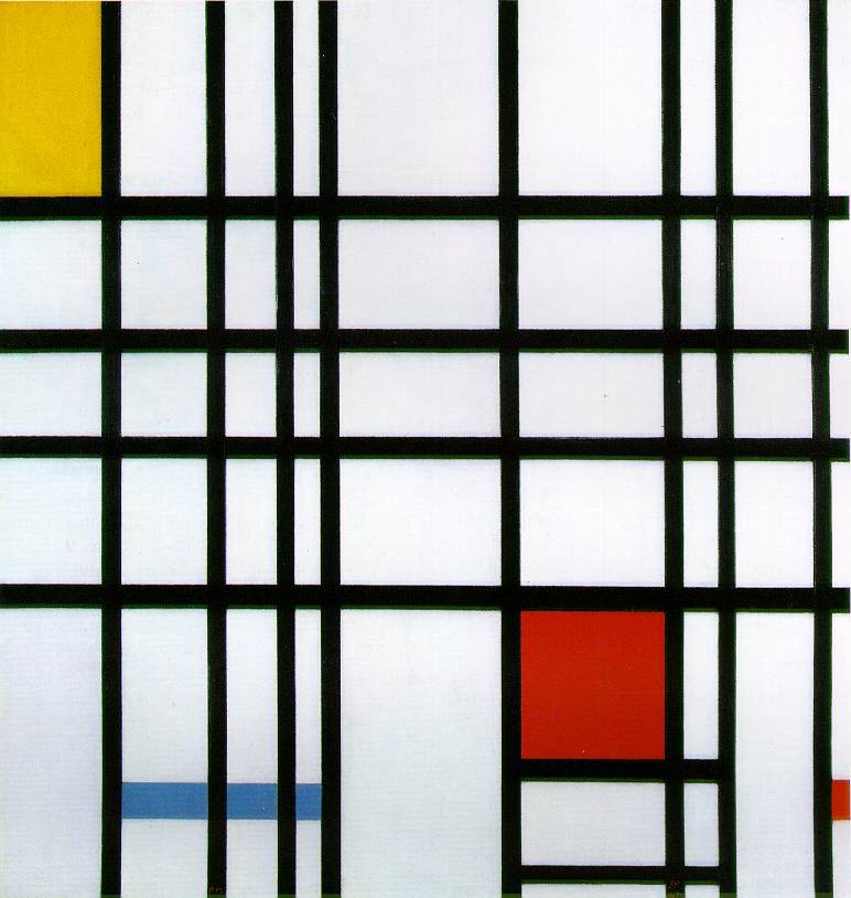
Piet Mondrian, Composition with Red, Yellow and Blue
1921; Oil on canvas, 39 x 35 cm
1921; Oil on canvas, 39 x 35 cm
This painting creates contrast by having everything be black and white except for the areas in color. The black lines lead the eye around to different areas in the painting, creating movement that keeps the eye going to the red, yellow and blue areas over and over.
Tuesday, October 8, 2013
PHOTOSHOP: MOVIE POSTER
MOVIE POSTER PROJECT
Your task is to create a movie poster. The poster must be made in the style of a real movie theater poster. The movie represented in your poster must be of your own creation. Do not make a poster for an existing movie.
GENRE: COMEDY or ACTION
GOAL: To inform people about and convince them to see the movie.
AUDIENCE: PG-13 moviegoers.
EXISTING SAMPLES: http://www.movieposter.com/ and http://step-art-tech.tumblr.com/ and http://www.htc-idvp.com/wp/?page_id=198 Look at a bunch of movie posters. Try to identify the point of emphasis, and the secondary/tertiary accents in the VISUAL HIERARCHY of the design. Think about how you will achieve this in your design.
POSTER CRITERIA:
1. 6 inches x 9 inches @ 300 DPI
2. Info coming soon:
*Clear VISUAL HIERARCHY. (There should be a point of emphasis, and secondary/tertiary accents.
*Definitive sense of SYMMETRICAL, ASYMMETRICAL, or RADIAL BALANCE to design.
*Some type of CONTRAST.
3. Your poster must incorporate a minimum of 6 separate images that have been worked into a cohesive image in Photoshop. You must include a movie title and other relevant movie text information.
4. Poster must include the use of at least 3 selection tools, 2 masking tools and 3 layer or brush tools.
5. At least four of the images must be public domain, creative commons licensed, or under your copyright, or copyright that someone has authorized for your use. Here are some good links for acceptable images:
http://search.creativecommons.org/
http://www.archive.org/
http://www.everystockphoto.com
http://sxc.hu/
http://freeres.info/
http://commons.wikimedia.org/wiki/Main_Page
http://morguefile.com/
6. You MUST include a bibliography of your image sources with your final design. Keep track of the websites you are getting images from by pasting links into a Word document.
7. Before you begin your final design, you must submit 3 sketch ideas for approval.
Thursday, October 3, 2013
PHOTOSHOP: CUSTOM BRUSH AND PATTERN, BLEND MODE AND LAYER STYLE LEARNING TARGETS
When you finish your examples:
1. Print each example.
2. Write the learning target and notes for how to do each procedure on the back of your printouts.
3. Staple together and turn in.
CUSTOM BRUSH

CUSTOM PATTERN

DOWNLOAD BRUSH


BLEND MODE AND LAYER STYLE

Subscribe to:
Posts (Atom)